
Page Element Styles
Choose the element styles you like for your customized website. Once we have your preferences, we’ll get started right away.
Navigation Options:
The navigation is a critical feature of any website. It links off to the main pages you want to showcase to visitors, as well as your logo and company name. On tablets and mobile phones, the navigation will be a drop down hamburger menu. On desktop, you can select the following layouts. Each configuration can be up against a solid background, or an image.
Single Column With Stacked Branding (Option A) – Over Solid/Gradient Or (Option B) Over Hero Image
Company Name
Home Services About Contact Blog
Home Services About Contact Blog
Company Name
Home Services About Contact Blog
Home Services About Contact Blog
Single Column With Side-By-Side Branding (Option A) – Over Solid/Gradient Or (Option B) Over Image
Company Name
Home Services About Contact Blog
Home Services About Contact Blog
Company Name
Home Services About Contact Blog
Home Services About Contact Blog
Double Column With Side-By-Side Branding (Option A) – Over Solid/Gradient Or (Option B) Over Image
Company Name
Home Services About Contact Blog
Home Services About Contact Blog
Company Name
Home Services About Contact Blog
Home Services About Contact Blog
Double Column With Stacked Branding On (Option A) – Solid/Gradient Background or (Option B) – Over Image
Company Name
Home Services About Contact Blog
Home Services About Contact Blog
Company Name
Home Services About Contact Blog
Home Services About Contact Blog
Triple Column With Stacked Branding On (Option A) – A Solid/Gradient Background or (Option B) – An Image Background
Company Name
Home Services About Contact Blog
Home Services About Contact Blog
Company Name
Home Services About Contact Blog
Home Services About Contact Blog
Triple Column With Side-By-Side Branding On (Option A) – A Solid/Gradient Background or (Option B) – An Image Background
Company Name
Home Services About Contact Blog
Home Services About Contact Blog
Company Name
Home Services About Contact Blog
Home Services About Contact Blog
Hero Section Options:
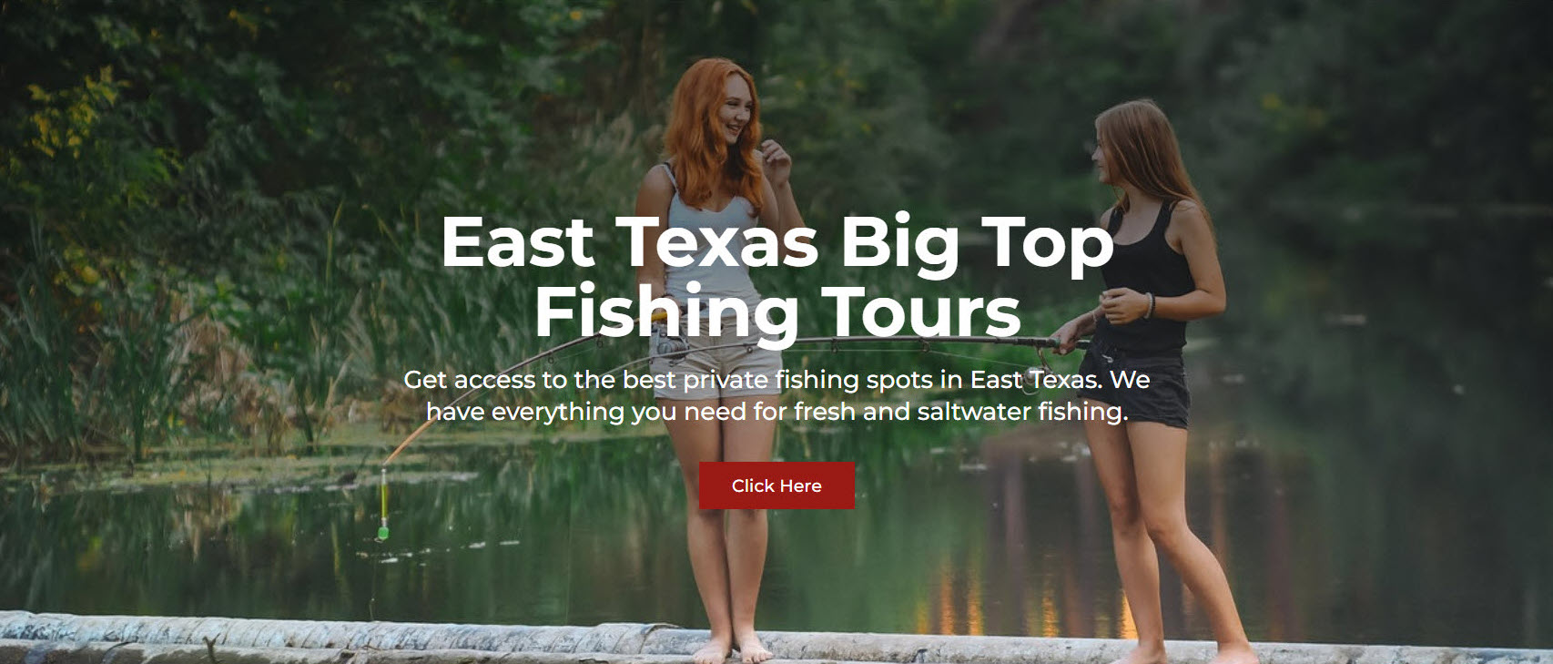
The Hero Section is the very first thing you see when you visit a homepage or a landing page, as soon as the page loads.
Hero Section 50/50 Option 1 (HS 1):
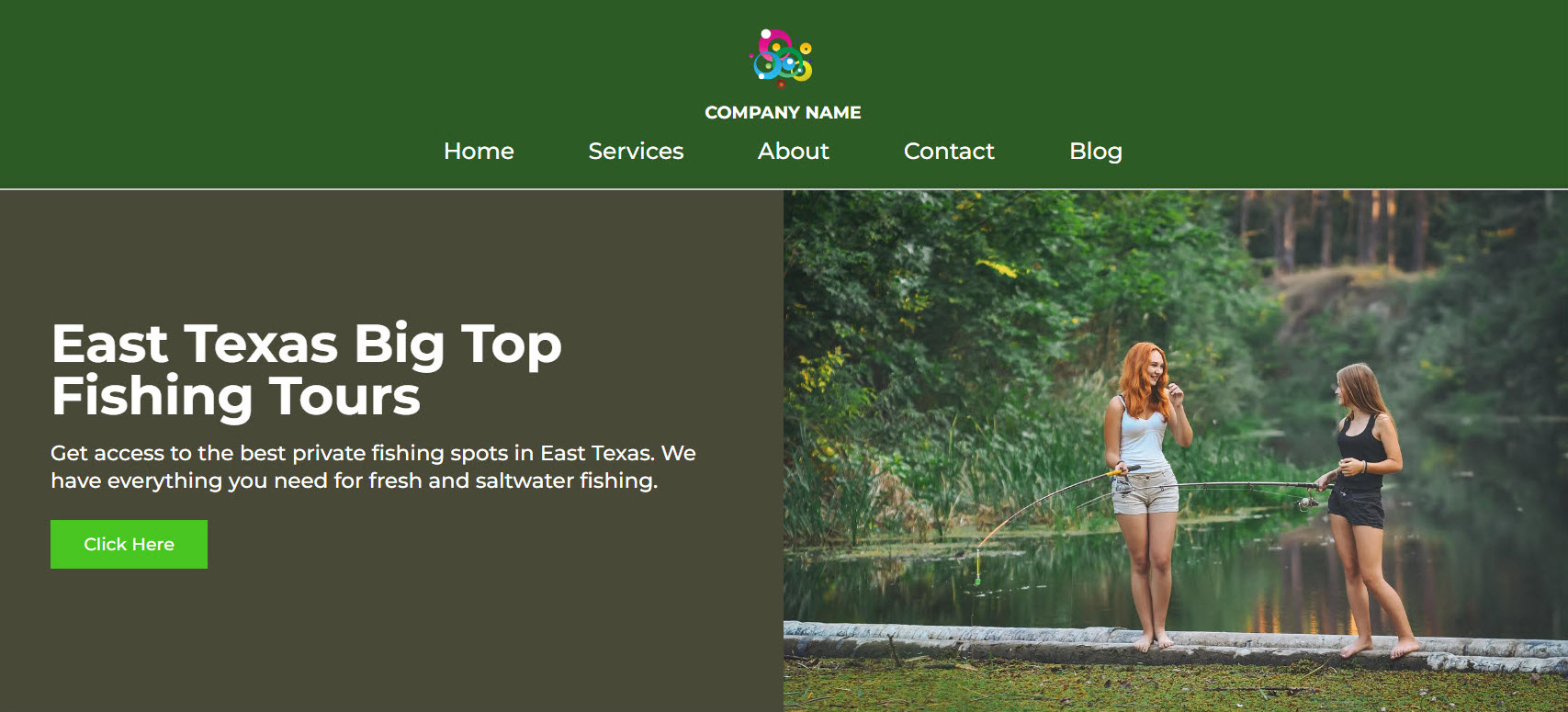
Home Services About Contact Blog
Hero Section 50/50 Option 2 (HS 2):

Hero Section 50/50 Option 3 (HS 3):
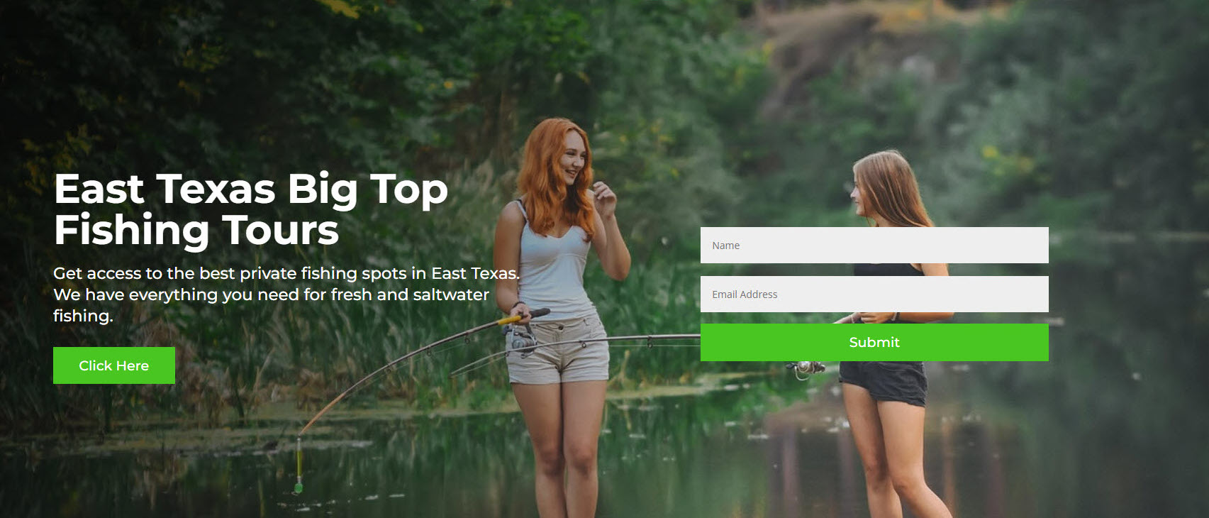
Hero Section Centered – Option 4 (HS4)
Card Options:
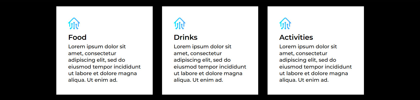
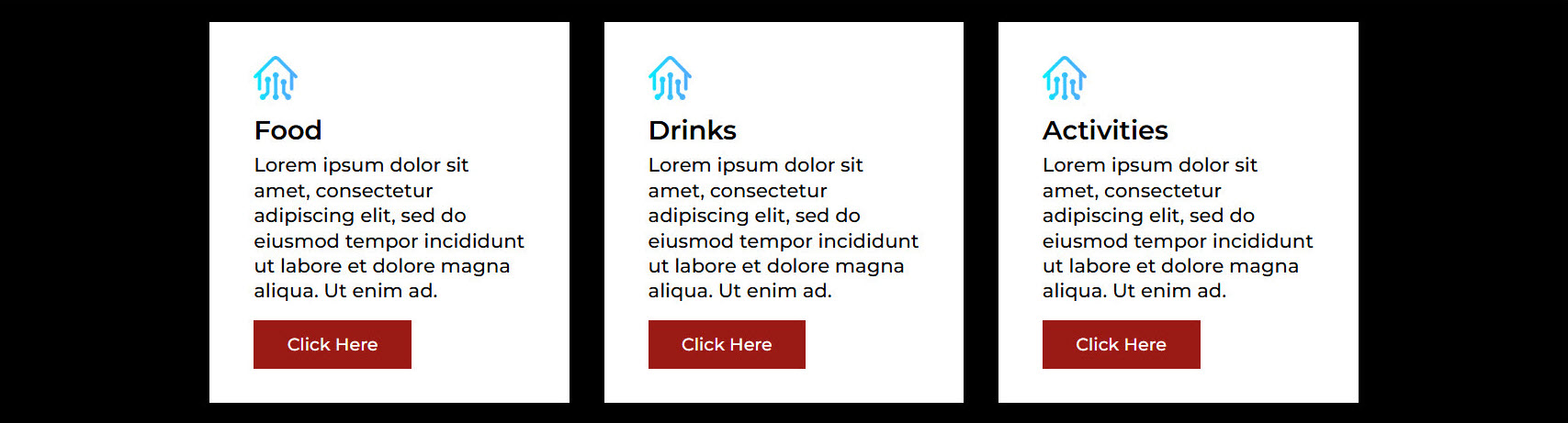
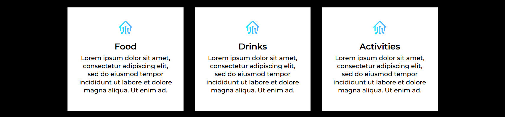
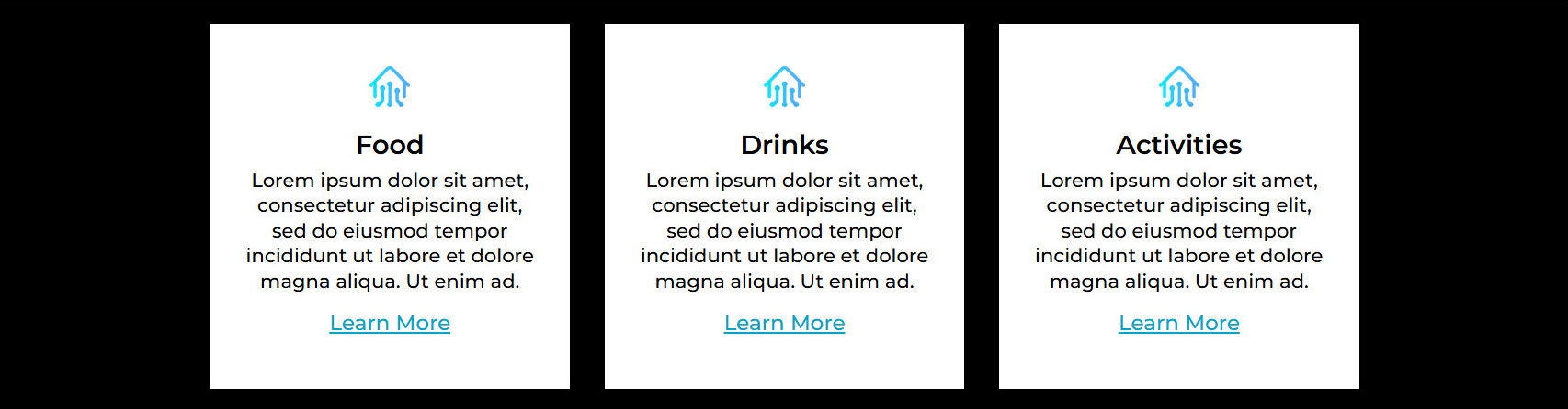
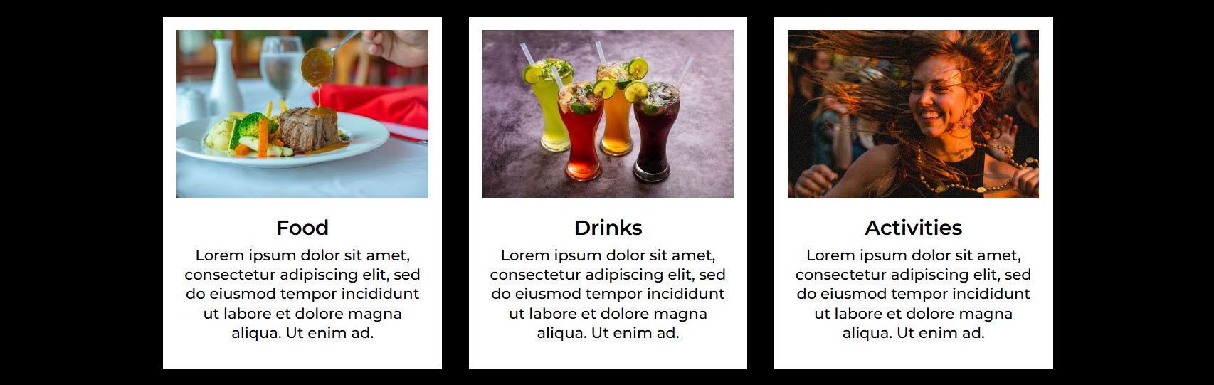
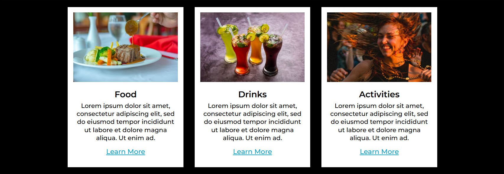
A card is a box element that may feature an image, text, a headline, and a CTA or button. Each card is centered around one subject.
Card Option 1 (C1): Top Left Icon – No Link or Button
Card Option 2 (C2): Top Left Icon – With Link or Button
Card Option 3 (C3): Centered Icon – No Link or Button
Card Option 4 (C4): Centered Icon – With Link or Button
Card Option 5 (C5): Image – No Link or Button
Card Option 6 (C6): Image – With Link or Button
Orientation Preference:
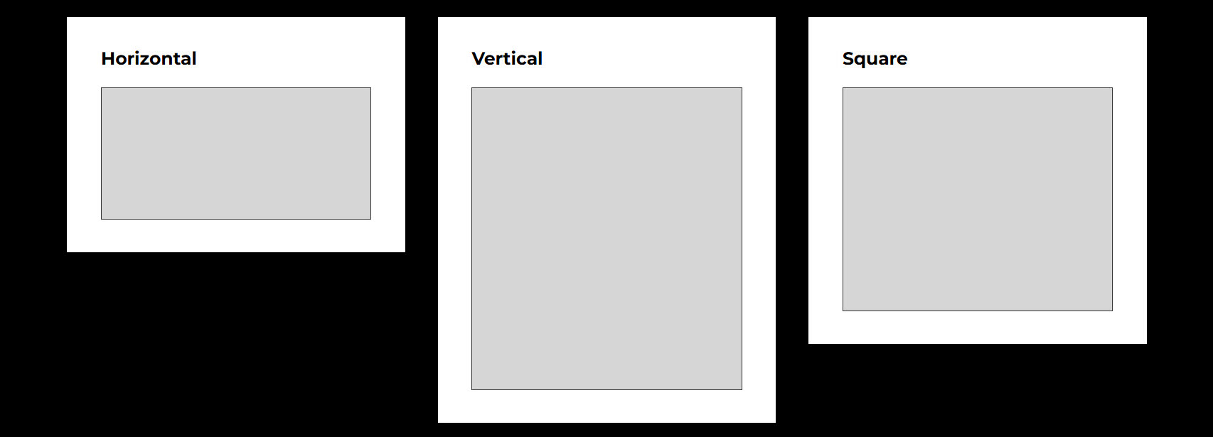
Generally speaking you have elements that are horizontal, vertical, or square in shape. Out of the three options, which do you prefer? This will be used for cards, images, etc.
Horizontal, vertical, and square orientation:
Corners Preference:
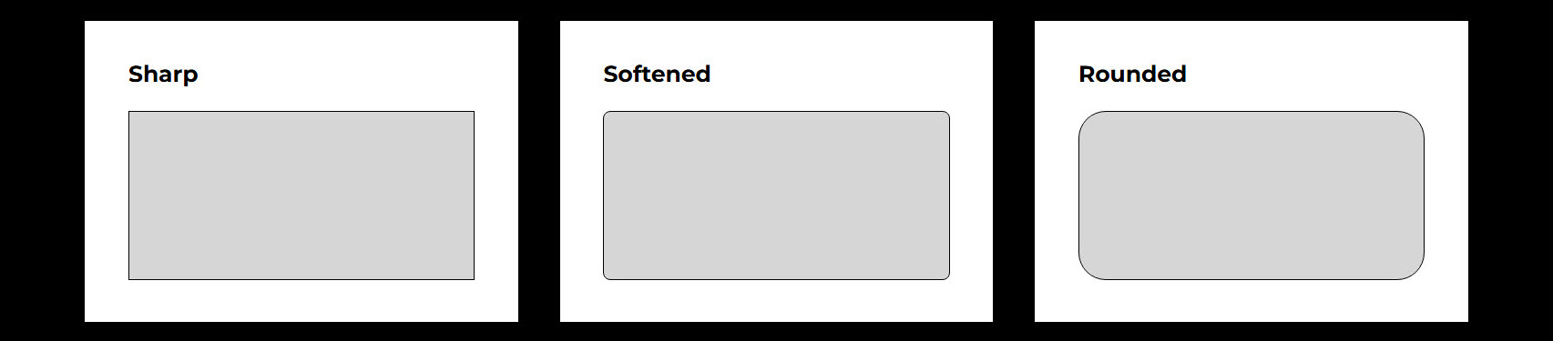
Corners come in 3 options… sharp, softened, and rounded. Of the 3 below, which do you prefer?
Sharp, softened, and rounded corners:
Three Random Combinations Of Styling Options:
You may have heard a lot of hot air from web designers trying to milk every penny they can about how everything has to be tweaked so it’s just perfect to work. That’s just as false as when people assume you can just slap anything together and come up with a good product.
One comes from greed, the other from lack of understanding… Both end up in the wrong place. You get something that’s outrageoulsy overpriced or something that looks like a 2nd grader made it. In the end, they both end up draining your wallet needlessly.